RHEANNE MCCORMICK
PORTFOLIO / DRIVING BY DESIGN / HACKER GARAGE / HMI CONCEPTS
K.I.T.T (v2)
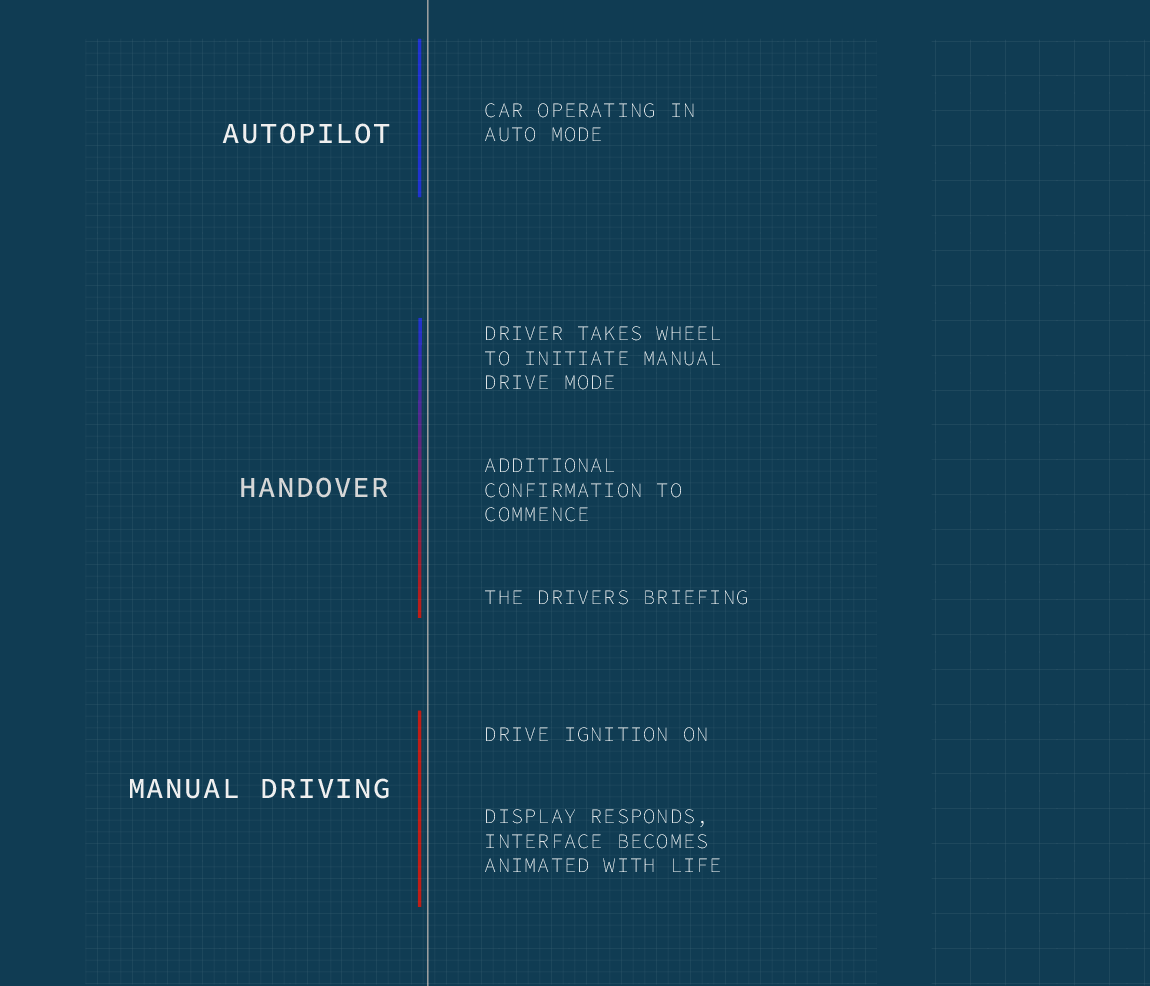
Following my research project ‘Driving By Design’, I wanted to experiment with creating a set of design concepts which gave the car a visual output for driving feedback expression.
I didn’t want to create something like what I had seen before, which were a lot of blue fake tach dials, with desktop like scrolling UI menus. As I had the non-restricted creative freedom to, I forgot about all of the rules and played around with layout, colour and type until I made something I thought better captured the experience of driving.
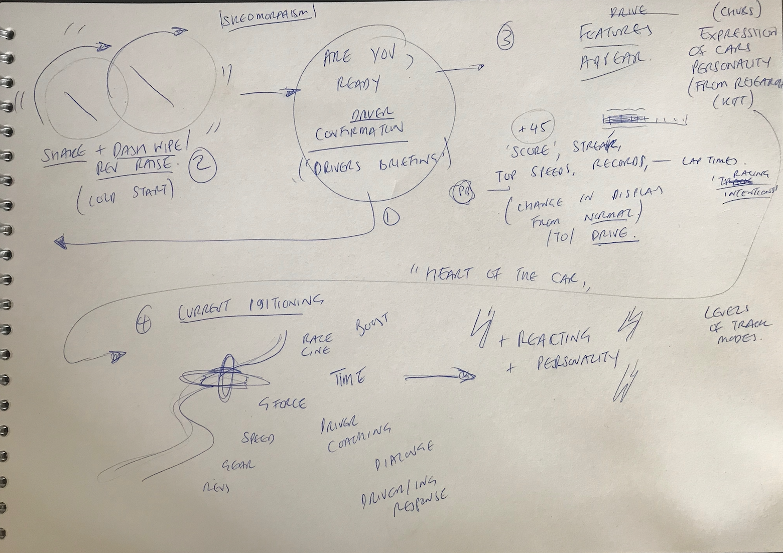
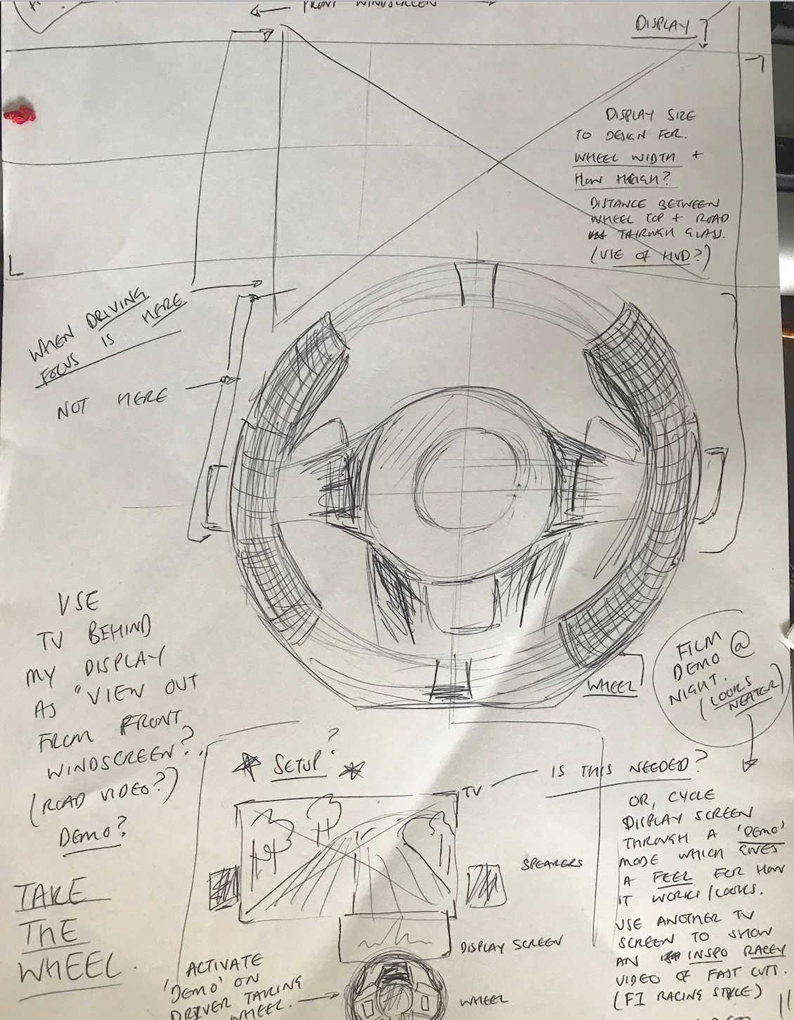
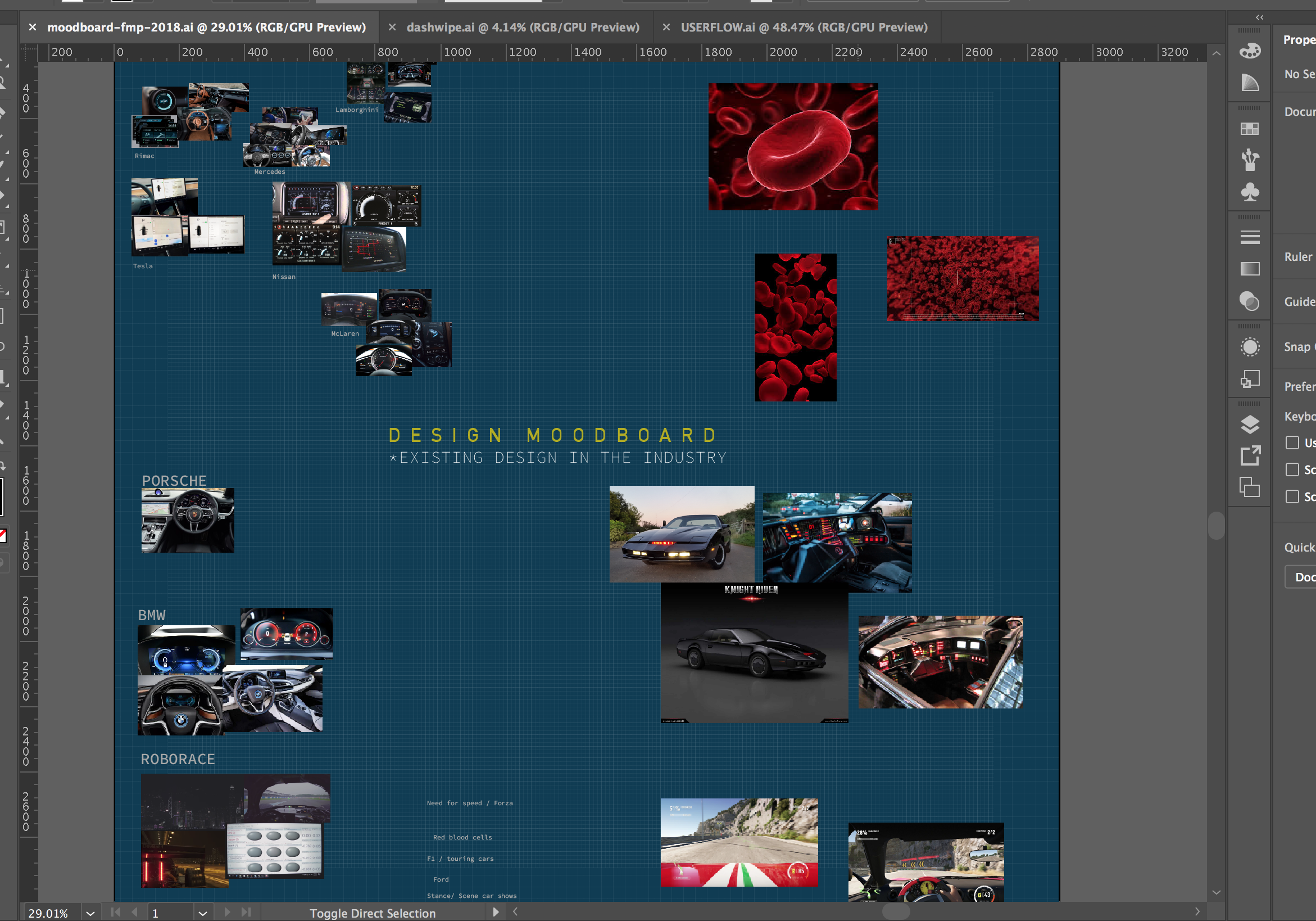
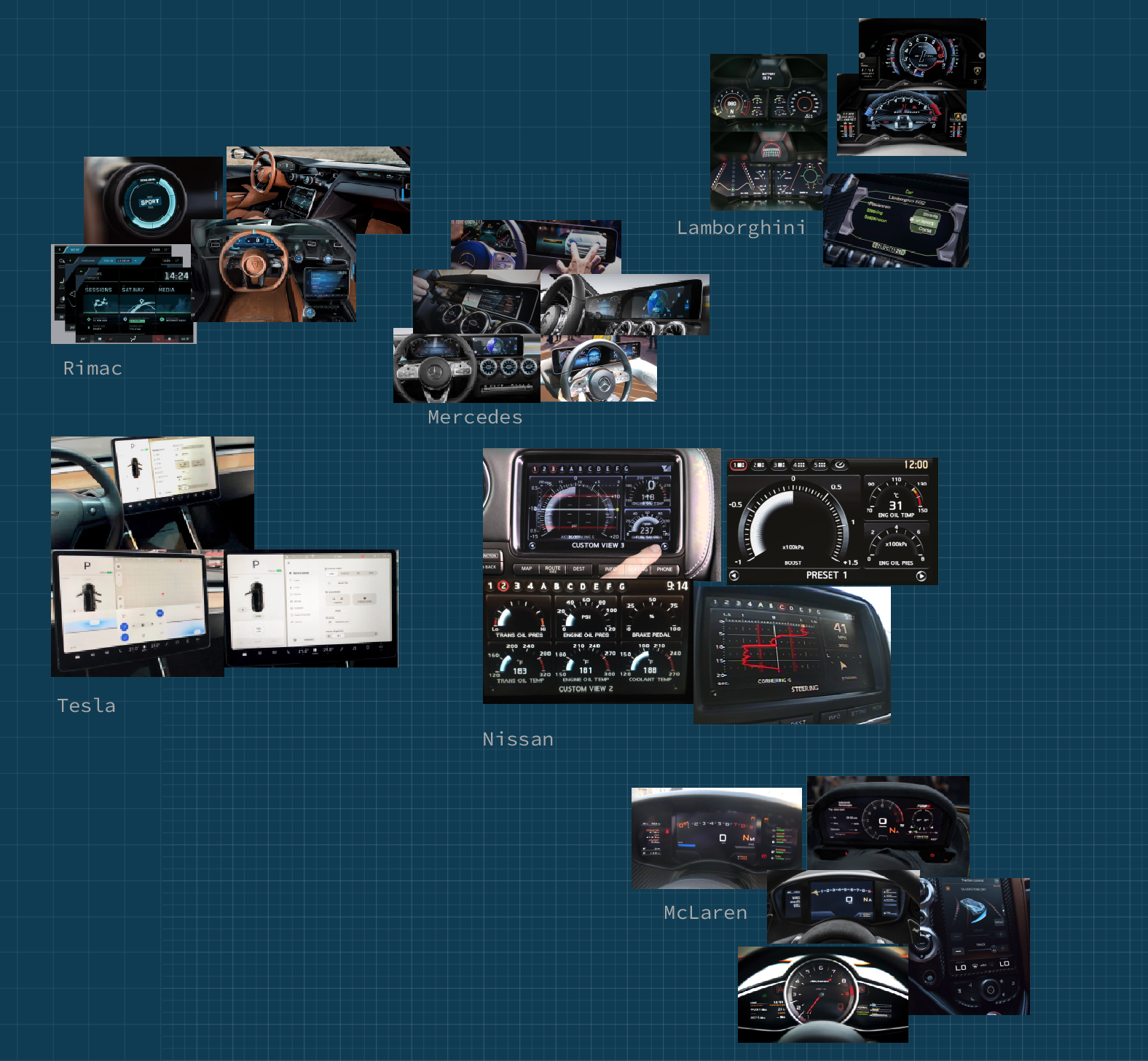
I began by wireframing my informational layout design ideas based on my findings from the study I conducted early on in my research. I used conceptual models from existing design used in modern sports cars such as BMW and Audi. I stuck to the most commonly used layout of one long ellipse with two smaller circles inside, aligned to the left and right of the shape. This layout was is popular with vehicle interface designers as it replicates the previous format of physical dials which represented driving data previously in older cars. Skeuomorphic design is a tool for onboarding to new technology which works well when users are adapting to a new technologies task flow, as famously demonstrated with the iPhone.
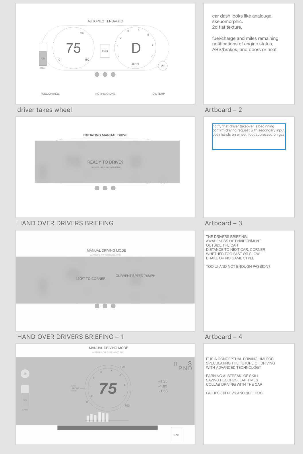
However, this design layout did not align with my goals for the outcome or purpose of my design. I felt there was too much structure, too much information and too many rules. I wasn't creating the visuals I had stuck in my head while I was sketching in my messy book after long drives in my car. I was simply creating app wireframes and userflows for processes and functions. This was not the focus of my work. I took some time to reflect on my research findings, re-read my original interview transcripts, and created a new document in Sketch. I started again with a blank canvas and my sketches and favourite interview quotes from my research for reference. I decided to abstract as much as I could.
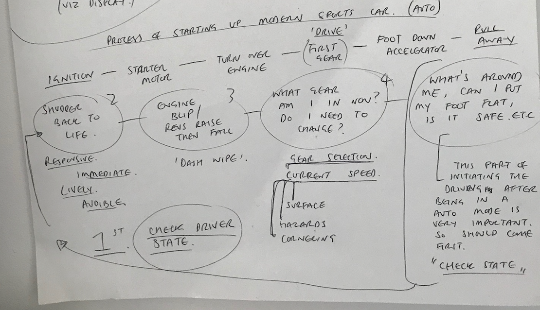
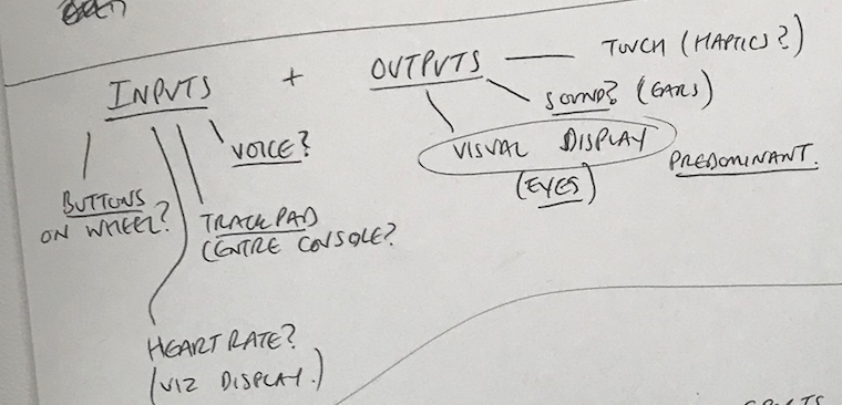
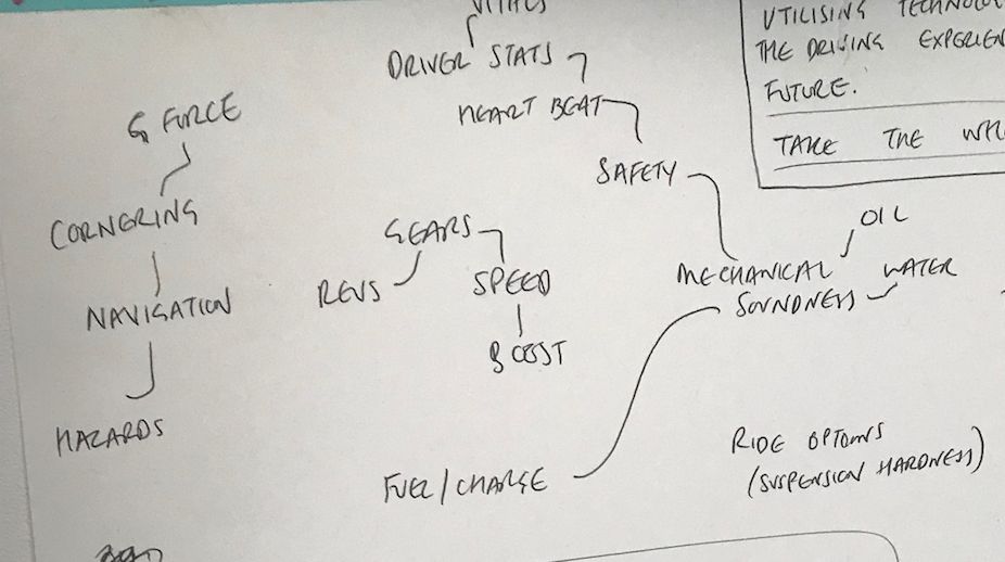
Thus began hours of moving around simple ellipses, experimenting with sizing, colour, gradients and shadows. I speculated how simplified I could make the interaction while still conveying the important information of speed and revs which were important feedback from the car.
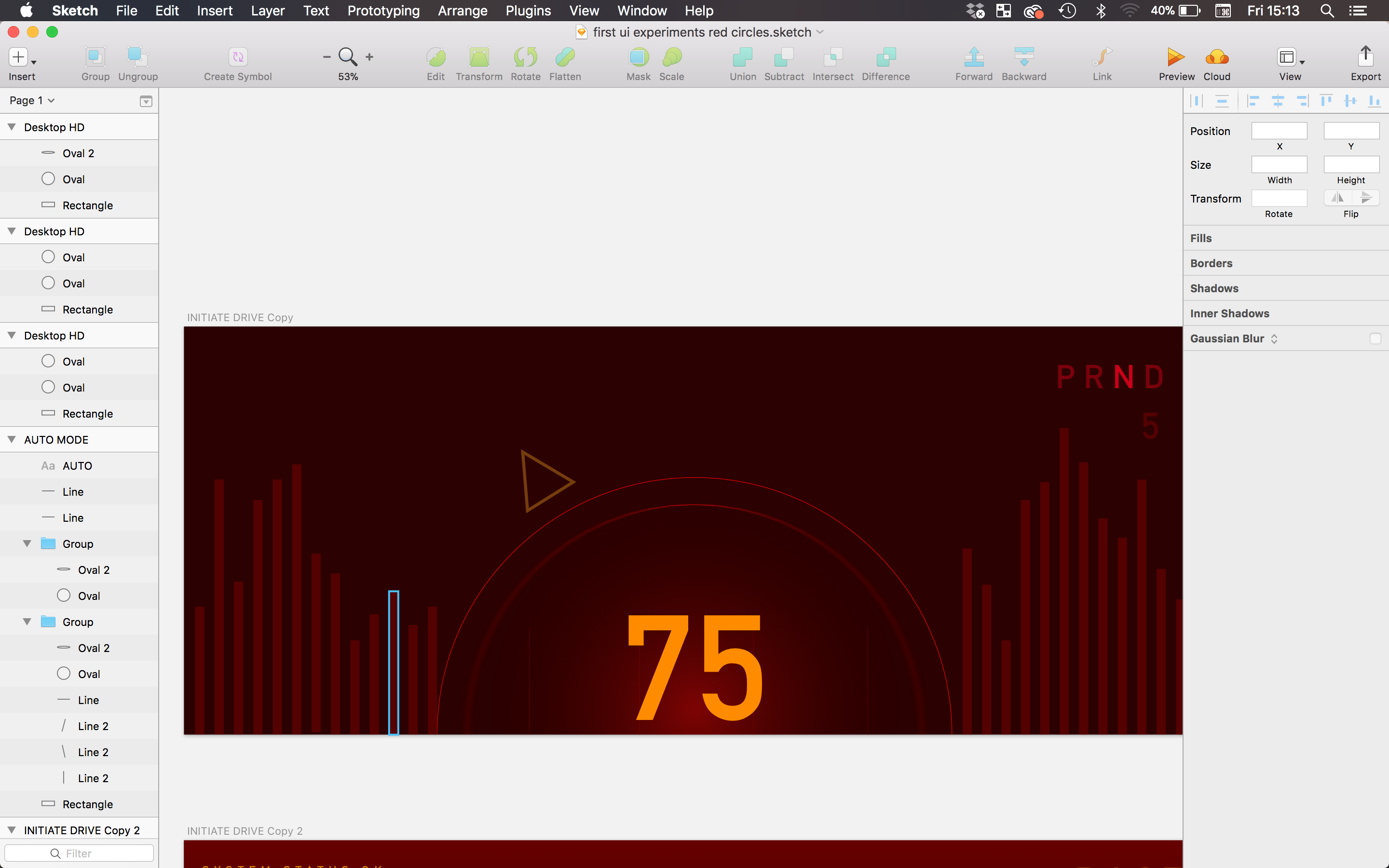
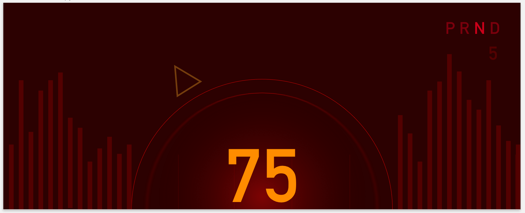
I focused on three succinct modes of operation, three different features of driving a car which aren’t sitting in stop-start traffic, commuting to work or any of the mind-numbing parts of being inside a car. I wanted to design for the best parts of cars. The thrill of sticking your foot down on a straight piece of road, the sensation of sheer power and only glancing at the dash long enough to see how fast you’re going - and whether a gear change is needed.
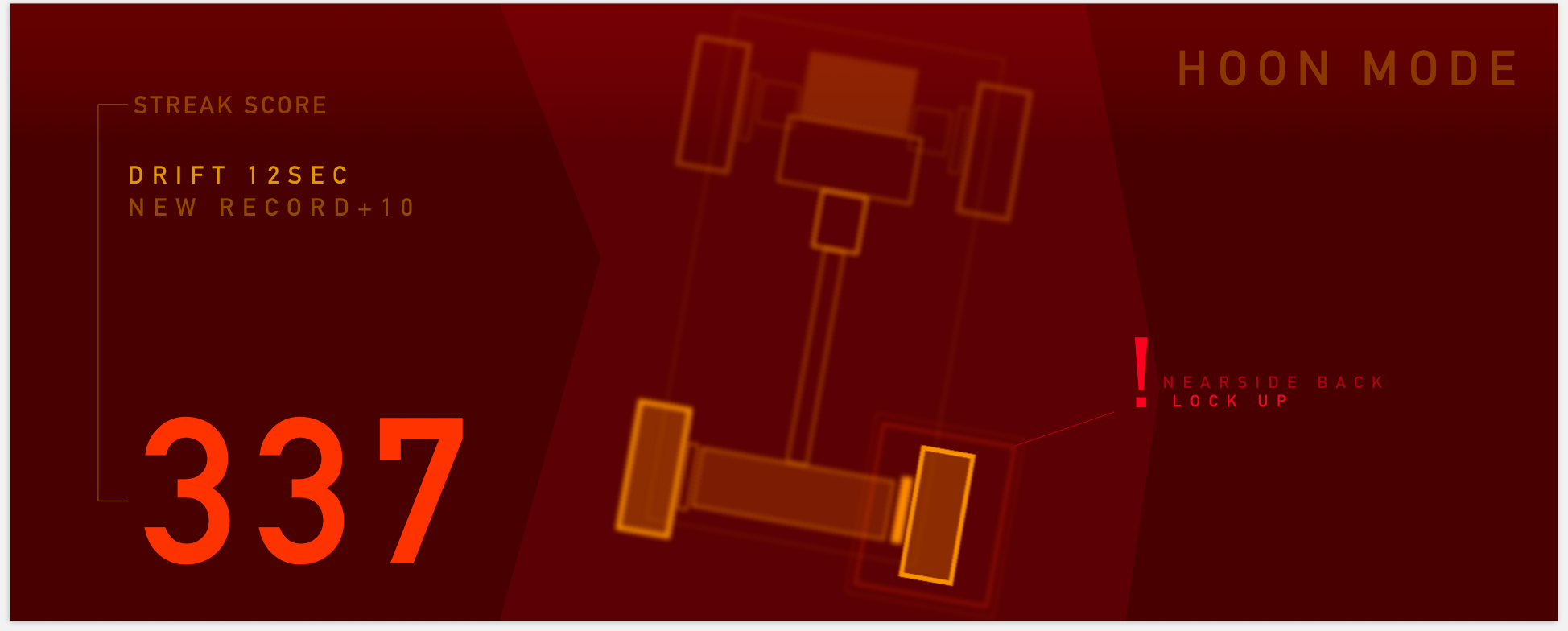
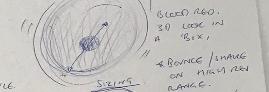
PERFORMANCE
Beyond the usual sports mode for track environments, this feature comes from a part of petrol head culture called ‘Hooning.’ Focused on tricks, streaks and pure skill.
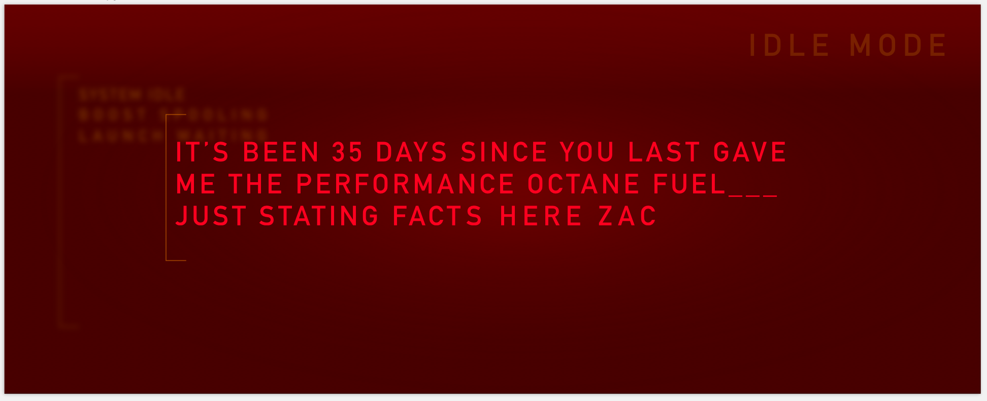
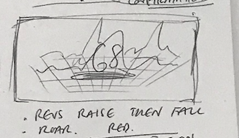
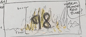
PERSONALITY
This design addresses research findings discussed in my report, 'Driving, by Design.'
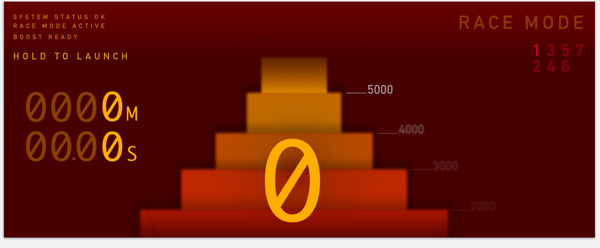
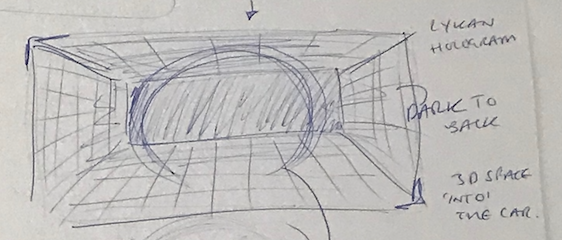
RACE
Minimal information, use of large type for important detail and graphical representation of power and engine revs building, aimed at racing.
My design deliberately chooses to ignore standard golden rules of UI. Windows, Icons, Menus and Pointers were thrown out of the window. My design goals from the beginning of this project were to create something with life burning inside of it, to give the car an interface with which to feedback and participate in the driving experience with the same raw connection as the driver. I wanted my design to focus on the values that my research clearly indicates car owners yearn for. Personality, character and individuality. This is not another dreamy futuristic UI. This is exactly the opposite. This is a digital performance piece.
My main influences for my design, beside my audience research, include Massimo Vignelli and Paula Scher. Vignelli's layout of the 1972 new york city subway map, was met by huge critism for his extreme abstraction, but in doing so he created an incredibly effective design. His bold design decision to choose form which best suited his work's purpose inspired me to ignore standard design rules, in favour of creating something as uniquely present in the experience as the driver. Scher's work treats type as graphical imagery which can be experimented with in ways not seen before with standard block text, without decreasing the content's informative value. She chooses to play with proportions, typefaces and font weights to create remixed, different information displays with passion and life that actually excite the viewer. Textual information is given a new function which extends past its common borders of exisiting only to convey a value.
Donald Norman, and Ben Shneiderman's UI golden principles of information design are purposefully ignored in favour of a performance visualisation. I wanted the display to reflect the impulsive, adrenaline fuelled, experience the driver has. I wanted the car to be abstracted from its functionality driven, utility-based mode of operation and completely transform into a raw, responsive, emotive creature. thus ignoring the standard rules of UI and employing the visual tactics of performative art and instilling character.
My final design consisted of three seperate 'modes' for driving, which were informed by my three main research findings. A set of three different modes of interaction with the car that revolve around a physical action. My key goal during this project was to have a digital display which put the focus back on driving and the experience of owning cars that has been the key in motoring heritage for decades. I am extremely satisfied with my concept outcomes and the workflow I developed while progressing through this project.
READING
- https://www.theverge.com/2017/1/10/14225738/ford-gt-digital-speedometer-cluster-supercar
- https://www.theverge.com/2017/3/1/14779540/mclaren-supercar-transforming-dashboard-video
- https://www.ces.tech/Show-Floor/Marketplaces/Self-Driving-Technology
- https://automobility.ideo.com/preface/intro
- https://www.simplypsychology.org/cognitive.html
- https://www.simplypsychology.org/mindbodydebate.html
- http://www.channel4.com/programmes/guy-martin-vs-the-robot-car/on-demand/66671-001
- https://www.dezeen.com/2017/10/28/honda-makes-artificial-intelligence-more-approachable-at-tokyo-motor-show-2017/
- https://drivetribe.com/p/modifying-cars-why-do-you-do-it-UXUMVOg7SuCzVWJqzn_qHw?iid=e6yv3mRLR4WrUFAoaxk2dg
- https://www.npr.org/2012/09/07/160766898/sound-a-major-emotional-driver-for-humans
- https://zach.se/generate-audio-with-python/
- https://www.theguardian.com/cities/2015/apr/28/end-of-the-car-age-how-cities-outgrew-the-automobile
- https://www.fastcar.co.uk/tuning-tech-guides/a-brief-history-of-car-modifying/
- http://ldt.stanford.edu/~ejbailey/02_FALL/ED_147X/Readings/nass-JOSI.pdf
- https://www.amazon.co.uk/Turn-Signals-Facial-Expressions-Automobiles/dp/020162236X
- https://motamem.org/upload/Emotional-Design-Why-We-Love-or-Hate-Everyday-Things-Donald-Norman.pdf
- https://www.researchgate.net/profile/Sandro_Garzon/publication/261165751_Intelligent_In-Car-Infotainment_Systems_A_Contextual_Personalized_Approach/links/55c1036208aed621de153dcf.pdf
- https://www.jstage.jst.go.jp/article/jje/53/Supplement1/53_S2/_pdf
- Abraham. H, Reimer. B, Seppelt. B, Fitzgerald. C, Mehler. B, Coughlin. J. (2017). Consumer Interest in Automation: Preliminary Observations Exploring a Year’s Change. Available: http://agelab.mit.edu/sites/default/files/MIT%20-%20NEMPA%20White%20Paper%20FINAL.pdf. Last accessed 15th Oct 2017.
- Centre for Connected & Autonomous Vehicles (2016). Pathway to Driverless Cars: Proposals to support advanced driver assistance systems and automated vehicle technologies. London: UK GOV. 1-30.
- Daimler. (2017). Company History. Available: https://www.daimler.com/company/tradition/company-history/1885-1886.html. Last accessed 3rd Sep 2017.
- Department for Transport. (2016). Vehicle Licensing Statistics Annual 2016. Available: https://www.gov.uk/government/uploads/system/uploads/attachment_data/file/608374/vehicle-licensing-statistics-2016.pdf. Last accessed 12th Sep 2017.
- Ford. (2017). 2017 Ford Focus Electric. Available: https://www.ford.com/services/assets/Brochure?bodystyle=Hatchback&make=Ford&model=Focus%20Electric&year=2017. Last accessed 2nd Jan 2018.
- GOV UK. (2017). Contributory factors for reported road accidents (RAS50). Available: https://www.gov.uk/government/statistical-data-sets/ras50-contributory-factors. Last accessed 1st Jan 2018.
- Honda PR. (2016). Honda to Showcase “Cooperative Mobility Ecosystem” at 2017 Consumer Electronics Show. Available: http://hondanews.com/releases/honda-to-showcase-cooperative-mobility-ecosystem-at-2017-consumer-electronics-show. Last accessed 20th Oct 2017.
- IDEO. (2017). The Future of Automobility. Available: Rousseau, J. (2016). Interaction16: UX Design Priorities for Semiautonomous Cars. Available: https://www.youtube.com/watch?v=oQqT8TSOKrE&feature=youtu.be. Last accessed 2nd Jan 2018. . Last accessed 4th Oct 2017.
- Kurzweil, R (2012). How to create a mind; the secret of human thought revealed. USA: Viking Penguin
- Maxwell, S. (2001). Car Cultures; Negotations of Car Use in everyday life. Available: https://ia800308.us.archive.org/15/items/DanielMillerCarCulturesBergPublishers2001/Daniel%20Miller-Car%20Cultures%20-Berg%20Publishers%20%282001%29.pdf. Last accessed 4th Sep 2017.
- Miller, D. (2001). Car Cultures. Available: https://ia800308.us.archive.org/15/items/DanielMillerCarCulturesBergPublishers2001/Daniel%20Miller-Car%20Cultures%20-Berg%20Publishers%20%282001%29.pdf. Last accessed 4th Sep 2017.
- Miller, D. (2001b) ‘Driven Societies’, in D. Miller (ed.) Car Cultures. Oxford: Berg.
- Miller, D. (ed) (2001a) Car Cultures. Oxford: Berg.
- Norman, D (2013). The design of everyday things. UK: Clays Ltd
- Rousseau, J. (2016). Interaction16: UX Design Priorities for Semiautonomous Cars. Available: https://www.youtube.com/watch?v=oQqT8TSOKrE&feature=youtu.be. Last accessed 2nd Jan 2018.
- Sheller, M. (2003). Automotive emotions, Feeling the car. Theory Culture & Society. 4 (1), 221-242.
- Simply Psychology, (2017), Maslow's Hierachy of Needs [ONLINE]. Available at: https://www.simplypsychology.org/maslow.html [Accessed 6 November 2017].
- Smith, T. Vardhan, H. (2017). Humanising Autonomy; Where are we going?. Available: https://ustwo.com/auto/humanisingautonomy. Last accessed 12th Dec 2017.